


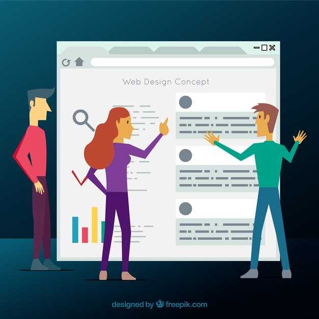
Open by default on desktop, with a clearly labeled close control and robust focus management. Hail the user with an easy path to content; anyone benefits from a predictable navigation pattern. Offer Suggestions that guide through sections, and imagine the route like parking and walking paths: direct, obvious, and free of foliage that slows you down. Avoid barriers that block their right to quick access and keep the interface durable across devices.
Build with a semantic nav region and a toggle that uses aria-expanded and aria-controls, so assistive tech can follow state changes. Include a skip-to-content link and keep a logical tab order. For touch targets, aim for at least 44×44 px; maintain contrast of 4.5:1 for text and 3:1 for UI parts. When the menu is open, trap focus inside until user closes it, then return focus to the trigger and announce the new state with an aria-live message. Keep the code light to avoid slowing page load.
For sites that offer varied content–lodges, hiking routes, bike guides, or city pages–an open menu on wide screens can surface suggestions quickly and help users discover sections without extra clicks. Use clear labels, avoid jargon, and place key items higher in the order. If you opt for a closed menu on small devices, ensure the toggle stays visible and presents a quick hint about what opens. Let the markup remain durable for their right to quick access.
Measure success with concrete numbers: time to content after toggle, percentage of users who use keyboard controls, and error rates on focus. Set a durable baseline design and extra guidelines for accessibility audits. In travel sites that showcase glaciers or outdoor lodges, a predictable, accessible menu reduces the time taken to reach critical information, lowers bounce, and supports anyone who rents bikes or plans trips. Use plain language, consistent icons, and an accessible close action to hail improvements in user satisfaction.
Decision Guide: When to Keep the Main Menu Open on Travel Content Pages
Keep the main menu open by default on hub-like travel pages that let users jump between roads, destinations, and content blocks. This keeps the flow smooth for your planning and onto new areas of interest while you roll through the epic content, from jersey to grinnell peaks and past adventures.
- Page type: If the page functions as a hub for multiple sections–routes, guides, or destinations–keep the menu open so users can switch sections without scrolling back up. This works well for lorona, apgar, and jersey-region content, including foliage guides, dinner tips, and grinnell peaks; heres a quick check to apply.
- User task load: If users often perform more than one action in a session (read, compare, map, view photos), keep the menu visible on top to support a flowing, low-friction experience. This reduces the number of extra steps and keeps surfaces and photos in a relatively consistent order.
- Viewport and layout: On wide surfaces and desktops, a persistent top menu is visible and helps users see all sides of the page without losing context. On smaller devices, just provide a clear toggle that expands over content, keeping the area below the header readable and avoiding a blocked view of key sections.
- Content type: For pages with dense itineraries–currents of roads, towns, and peaks–such as lists that include past, state, and grinnell references, keep the menu open. It also helps when you present dinner options, local tips, and maps alongside photos; include huckleberry hints wherever relevant.
- Accessibility: Ensure the toggle is keyboard-friendly, announces state clearly, and maintains focus order. Screen readers should report whether the menu is open, and the tab sequence should stay intuitive as you move between surfaces and sections.
- Testing and metrics: Run quick checks with real users: measure time to access a second destination, track clicks to maps, and watch whether keeping the menu open reduces back-and-forth navigation on hub pages.
Bottom line: On pages that provide an epic overview of a region or route–think grinnell peaks, jersey shore, and apgar area itineraries–keep the main menu open to support a wide, flowing exploration. For long reads or single-article guides, offer an accessible toggle so your visitors can still navigate with confidence, whether they’re planning a state park visit or a dinner stop along a scenic byway. lower friction helps your readers stay on track even when they hiked through foliage and past lookouts.
Focus Management and ARIA: Keyboard-Only Access for the Menu Toggle
Implement a single, clearly labeled menu toggle that uses aria-expanded and aria-controls, and apply a focus trap so keyboard users can navigate without leaving the component. When opening, focus the first item; when closing, return focus to the toggle. This stop prevents difficult focus wandering and keeps access reliable.
Structure and semantics matter: the menu container should use a role such as menu or navigation and be labeled by the toggle via aria-labelledby. Each item should be a native button or link, and a roving tabindex keeps one item focusable at a time. These choices share a clear rhythm across these pages, including rented rooms or listings in kalispell and whitefish, so readers experience consistent accessibility beauty and predictable views when entering the menu.
Keyboard interactions guide the flow: Tab moves into the menu, ArrowDown and ArrowUp cycle through items, Enter or Space activates the focused item, and Escape closes the panel. The panel’s aria-expanded value reflects the current state, while aria-hidden hides the panel when closed. This approach would land solid access across short and long menus, helping users share a smooth post-open experience without losing context as they navigate deeper into the site.
Timing and focus order matter for real-world use: aim for a short, predictable focus sequence so entering the menu lands on the first item within 1–2 keystrokes and cycles through 4–6 items naturally. After closing, restore focus to the toggle so the user can leave the interaction cleanly. Use a polite announce via aria-live on state change, but keep the visible focus path straightforward, ensuring views remain calm and simple for both seasoned keyboard users and newcomers in these locales like kalispell and whitefish.
Delivery notes for teams: test with a keyboard-only flow, verify color contrast of at least 4.5:1, and confirm all items are reachable without a mouse. If the toggle controls a compact panel on small screens, ensure the same focus rules apply and that the panel remains accessible when the viewport tightens. Share these findings in a post-rollout checklist and apply them across related pages, including spaces listed as rented, to keep the experience cohesive and sure of being accessible in diverse contexts.
Labeling and Landmarks: Clear, Descriptive Menu Items for Glacier National Park Fall Content
Label each top item with a landmark that visitors can locate in fall. West Glacier offers crisp vistas and multiple turnout points, so tie menu items to a real place and a visible feature. If you went to Logan Pass or Eagle Point, you know how precise labels help people get oriented. Use a consistent pattern: feature name followed by a short descriptor. Keep labels short but exact; this simple rule helps screen readers and keyboard users, and it makes the site easier to scan. Looking for fall colors? Labels that point to a known feature perform better, and youre sure your audience will learn the map quickly.
Organize the navigation to reflect national park content and fall themes, with dedicated items for state and federal access. For example, add labels like Continental Divide Lookout, Wildflowers in the Fall, Seven Falls, Eagle Bend Trail, and Blackfeet History. Include lodging details as distinct items, such as Rental Cabins or Family Rooms, and indicate child-friendly options where appropriate. If you offer rooms or apartments near park entrances, label them clearly as Rooms or Rentals, and link them to booking pages. This approach supports multiple user paths and helps families, couples, and solo travelers plan efficiently. Labeling lodging as its own items treats accommodation as a first-class navigation target.
Descriptive, accessible labels also support search and discovery. Please point users toward key places to start, and provide a concise note about what to expect at each item: highs (daytime temperatures) and recommended activities, or whether a site is excellent for quiet contemplation or active exploration. The goal is to make it easy to find activities that match interests, such as wildflowers, eagle viewpoints, or a scenic drive along the continental route. If you want, add a brief hint about parking, safety, and what to bring for fall conditions, including water, layers, and a map.
Descriptive Menu Item Examples
Examples include West Glacier Highlights, Eagle Point Lookout, Continental Divide Lookout, Seven Falls, Wildflowers of the Falls, Blackfeet History Center, Eagle Bend Trail, Rental Cabins, Family Rooms, Children Activities, Places to Stay, State Park Visitor Center, National Park Information, and Local Tips. Please review each item for accuracy against current maps, ensure the wording is concise, and keep the number of words per label to two or three for quick scanning. If multiple items reference the same location, differentiate by feature, not by generic terms. Done right, the menu becomes a reliable guide for visitors and a learning tool for first-time explorers.
Interaction Testing: Keyboard, Screen Reader, and Mobile Tap Target Checks
Begin keyboard-first testing now: map the focus order across the main menu, search, and modal flows, verify visible focus on every interactive element, and fix traps when a menu is closed so focus lands predictably. For months, apply this to the entire navigation, not just the first screen, so the village users experience a smooth trail through content. Think of it as guiding the user through a scenic path with trees lining the edge; seeing the flow clearly reduces friction. This approach will save time before broader testing, and it helps west-facing teams avoid the rocky edge of late changes. Here you can enjoy an amazing improvement, especially when the beginning of your service shows clear, accessible behavior. youve got to keep things flowing and taken with care, since millions will benefit from a consistent, snackable accessibility rhythm. Keep snack, savory treats in your checklist to maintain momentum, and treat the process as a steady, runnable trail that adapts to swiftcurrent environments, eagle-eyed reviewers, and practical cases that pass the audit.
Keyboard navigation and focus management

Ensure every interactive element receives a visible focus state and that the tab order mirrors the visual layout. Verify skip links reach main content immediately, landmark regions are clearly announced, and aria-labels describe controls when text is not visible. When opening a menu or modal, move focus to the first focusable item and, on close, return focus to the trigger element or a predictable point in the flow. Avoid trapping focus in closed panels; keep a predictable end-to-end flow that supports users who rely on keyboard navigation, screen readers, or mixed devices. Test across devices and contexts to confirm the edge cases are handled, especially with off-canvas menus and dynamic content updates.
| Maydon | Test Step | Method | Expected Result | Actual Result | Eslatmalar |
|---|---|---|---|---|---|
| Klaviatura navigatsiyasi | Tab sequence across main nav | Manual keyboard | Focus order matches visual layout; visible focus | Pass | If a sub-menu opens, focus moves to first item |
| Modal dialog | Open with keyboard, close with Escape | Manual keyboard | Diqqat tetikka qaytadi; tuzoqlardan xoli | Pass | Escape tugmasi fokus qopqonini tozalashiga ishonch hosil qiling |
| Tashriflardan oʻtish | Asosiy tarkibga o'tish | ARIA belgilari | Asosiy hududga diqqatni qarating | Pass | Menyu yashiringan paytda ko'rinadi |
| Tugma nishonlari | Sensorli qurilmalarda navigatsiya | Qo'lda kran | Nishonlar osonlik bilan bosiladigan qilib mo'ljallangan; joylashuv qo'shni bosishlarning oldini oladi. | Pass | Minimal maqsadli oʻlcham koʻrsatma sifatida |
Ekran oʻquvchi mosligi va mobil teginish nishonlari
Rollar va aria-belgilari elementlarni aniq tavsiflashiga va dinamik o'zgarishlar foydali tartibda e'lon qilinishiga ishonch hosil qilish uchun ekran o'quvchi tekshiruvlarini o'tkazing. Mobil qurilmalarda teginish nuqtalari tavsiya etilgan o'lcham va oraliqqa mos kelishini tekshiring, shunda foydalanuvchilar tasodifan qo'shnilarni bosib yubormaydilar. Diqqatga sazovor joylar va jonli hududlar foydalanuvchilardan taxmin qilishni talab qilmasdan tuzilma va yangilanishlarni yetkazishini ta'minlang. Ushbu amaliyot millionlab seanslar davomida aniq, izchil fikr-mulohazalarga olib kelishi kerak, bu yerda va hamma joyda tajribani ajoyib his qiladi. Qanday davom etish kerak: VoiceOver yoki TalkBack bilan sinovdan o'tkazing, o'qish tartibi vizual tartibga mos kelishini tekshiring va trigger elementlari o'z maqsadini qisqacha e'lon qilishini tasdiqlang. Go'zal joydagi haqiqiy stsenariy uchun, masalan, qishloq do'konining joylashuvi yoki yo'l xaritasi ilovasi, foydalanuvchi fikr-mulohazalari tarqatishdan oldin ishonishingiz mumkin bo'lgan ishonchli signalga aylanadi - siz erta va tez-tez tekshirishingiz kerak, ayniqsa kontent tez o'zgarganda va xizmat xabarlari paydo bo'lganda.
Glacier Milliy bog'iga kuzgi tashrif: Ob-havo, yo'l holati, yovvoyi hayvonlar va rejalashtirish bo'yicha ma'lumotlar
Jo'nashdan oldin Going-to-the-Sun yo'lining holati va park prognozlarini tekshiring. Kuzda vodiylarda harorat 40–60°F atrofida saqlanib turadi, kechalari 20–30°F gacha tushadi va oktyabr oyida yuqori balandliklarda qor paydo bo'lishi mumkin. G'arbiy yo'nalishlar yumshoqroq bo'lib qoladi; aksincha, sharqiy qismi kun yorug'ligi qisqarishi bilan tez soviydi. Piyoda sayohatlarni erta boshlang va qatlam-qatlam kiyining: shamol o'tkazmaydigan ko'ylagi, izolyatsiya qiluvchi qatlam, shapka, qo'lqop va soyali joylarda muz uchun tortish moslamalari. Yovvoyi tabiatni hurmat qiling, ayiqlar o'tloq chetlarida oziqlanadi va burgutlar Makdonald ko'li, Sent-Meri va Jozefin hududlari yaqinidagi ko'llar uzra aylanadi. Xavfsiz masofani saqlang, ovqatni himoyalang va chiqindilarni imkon qadar ayiqlar himoyalangan konteynerlarda saqlang. Sahna hayratlanarli cho'qqilar, yuqori havzalarda qolgan muzliklar va qirg'oq bo'ylab joylashgan tarixiy uylar orasida joylashgan. Glacier milliy bog'i nomi notekis erga ega va uning ichida siz chuqurlik ko'llari va uzoq tog'larning aralashmasini topasiz. Agar siz mashina haydasangiz, Nissan SUV qiyaliklarni bardosh bera oladi; Virginiya, Alyaska va boshqa shtatlardan kelgan sayohatchilar ko'pincha kuzgi sayohatlarni rejalashtiradilar, ular park ichida qolishdan ko'ra, Vaterton tajribasi uchun Kanadaga ham borishlari mumkin. Glacier ichida g'arbiy va sharqiy tomonlarni o'rganish uchun vaqt ajrating, ularning har biri ko'llar atrofida noyob manzaralarni taqdim etadi.
Kuzgi tashrif uchun kontentni rejalashtirish ochiq yoki yopiq menyu holatida navigatsiyani qo'llab-quvvatlaydigan qisqa qo'llanma yaratishni anglatadi. Ob-havo haqida qisqacha ma'lumot, Yo'l holati paneli va Yovvoyi tabiat ogohlantirishlari bo'limini, shuningdek, bir necha kunlik sayohatlar va uzoqroq qolish uchun qo'shimcha xavfsizlik maslahatlari va amaliy g'oyalarni qo'shing. Bearclaw ko'li bo'ylab piyoda sayrlar, josephinlar hududi va sohil bo'yida joylashgan tarixiy uylar haqida ma'lumot bering. Yaxshiroq marshrutlar to'plamini taklif qiling: 1-2 kunlik g'arbiy ko'l davrasi, tog' manzaralari bilan biroz uzunroq sharqiy davra va AQShda qolib, Uoterton hududiga Kanada kengaytmasi. Yuklab olinadigan ro'yxatlar, rasmiy park qo'llanmasiga havola va ish stoli va mobil uchun oddiy navigatsiya qulay xaritani taqdim eting. Kontentni ochiq saqlang, aniq sarlavhalar, rasmlar uchun alt matni va izchil yorliqlash bilan mehmonlar kerakli ma'lumotni tezda topishlari mumkin.