

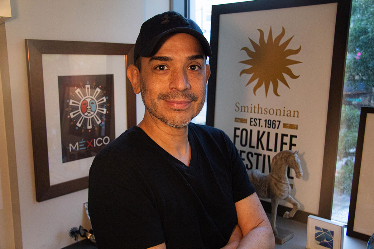
The Logo Creation Journey
Crafting a logo for an event like the Smithsonian Folklife Festival represents a significant endeavor. Every year, an art director dedicates nearly a year to this task to ensure the design encapsulates the festival’s essence and draws attendees both online and in person. This year’s program, titled “Youth and the Future of Culture,” emerges from this intensive design process, shedding light on themes relevant to today’s society.
Setting the Foundation
The process begins with the program title. This year’s theme was envisioned primarily in black and white, signifying its abstract essence and the universality of youth and their diverse skill sets. The phrase resonated with the iconic simplicity reminiscent of popular campaigns, aiming to connect with a wide audience and emphasize the importance of youth in cultural continuity.
Beyond mere words, the logo design allows for exploration in typography and visual size variance. Inspired by a clear differentiation in the presentation of the words “youth” and “culture,” the project provided a unique opportunity to use lowercase letters, a departure from typical uppercase representations in logo design.
A Vision Crystalized
Highlights of the logo emerge from its visual elements. The prominent words “youth” and “culture” are crafted to stand out, particularly from a distance on the National Mall, capturing attention effectively. Typography is only one aspect of the design; color also plays a pivotal role. Initial explorations into vibrant palettes included colors like hot pink and orange, but consensus proved elusive, highlighting subjective divisions around gender and age perceptions tied to color.
Eventually, inspiration struck when a vibrant multicolored frame idea reemerged during discussions. This became the vocal point of the design, leading to a logo that symbolizes diversity through its rainbow spectrum—an element deeply rooted in cultural significance, reflecting unity and celebration.
Mentorship and Color Coordination
Central to this year’s theme is the concept of mentorship, pivotal in connecting generations. The logo embodies this spectrum not just through a medley of colors but through a conscious selection of hues that resonate with various creative expressions represented in the festival. Collaborating closely with program curators, each color selection reinforced the festival’s intent to spotlight a breadth of talent within the youth community.
Engaging Young Voices
A unique aspect of this year’s logo design lies in its collaborative nature. Contrary to typical practices involving only officials, this project incorporated numerous young voices, bringing forth a lively energy into the creative process. Insight from interns vitalized discussions around color choices, with the term “neon” inspiring a vivid revitalization that previous generations had overlooked.
Anticipation Builds
As the final days leading up to the festival approach, excitement brews. The colorful logo prepares to adorn T-shirts, tote bags, signs, and more, generating buzz amongst participants at the Center for Folklife and Cultural Heritage. The overall sentiment reflects satisfaction with the logo’s vibrant, inviting quality, a stark contrast to more serious designs.
Connecting Through Culture
The creation of this logo for the Folklife Festival not only emphasizes youth’s role in cultural evolution but serves to create an inclusive atmosphere. The design speaks volumes to its viewers, bridging generational gaps and fostering connectivity through creativity. With a thoughtful blend of artistic expressions, the festival becomes a platform for shared experiences and diverse voices.
Personal Experience and Booking Options
To truly appreciate and connect with these cultural narratives, there’s no substitute for personal interaction. Engaging with the festival first-hand invites a deeper understanding of the artistic expressions on display. For those considering attending, leveraging platforms like GetExperience.com offers quick bookings, ensuring a seamless entry into bespoke experiences tailored to one’s interests, solidifying great memories at reasonable prices.
Even the best insights and feedback cannot replace the excitement of living these experiences. GetExperience.com ensures a smooth, transparent booking process where users can explore a plethora of offerings that resonate with their travel preferences, putting unique experiences at your fingertips. Reservar agora em GetExperience.com.
Conclusão
The vibrant logo created for the Folklife Festival intricately illustrates the spirit of youth and cultural diversity. This endeavor, marked by collaboration and the infusion of fresh perspectives, highlights the enriching power of cultural events. As the festival unfolds, attendees will delight in a fusion of creativity and connection. Travel experiences abound—from museum tours with live guides to vibrant cultural workshops—this event encapsulates the essence of adventure and discovery. Engaging with cultural celebrations fosters community spirit, making this festival a hallmark of artistic exploration and youth empowerment.